Onyx Coffee Lab at the Momentary is a third-wave coffee bar and café. The simple program includes a coffee bar, café, patio and kitchen.
The design process began after the decision was made to put a coffee bar in the Momentary, an old Kraft Cheese factory converted into a contemporary art museum. Drawing inspiration from the vast network of existing machinery within the museum, Onyx was originally conceived as a meditation on the duality of human and robot, past and present. The large glass coffee bar spans the length of the space, servicing both its own small seating area and the museum lobby. To-go service is either made by a robotic pour-over or delivered on a conveyor belt that runs through the space. To-stay service is made by a human barista and handed directly to the patron.
In contrast to the raw materials of the museum, the café is carefully curated. Shades of pink set the space apart from the rest of the museum, inviting guests to be immersed in an experience. A simple material palette of terrazzo tile, white perforated metal and glass create a soft, luminous interior.
Photos by Keetun Pierce
The Onyx HQ in the 1907 building, located in historic downtown Rogers, is an ambitious assemblage of different uses, including cafe, speakeasy, cocktail lounge, classroom, bakery, cupping lab, roastery, offices, event space and prep kitchen.
Originally built by the Rogers Wholesale Company in 1907, the stately 30,000 SF brick and timber-framed warehouse has been a centerpiece of downtown Rogers life for over a century. Located adjacent to the railroad tracks, the building was historically the nexus of produce and goods shipping and distribution for the region. In the 1960’s, the building fell into disuse and traded owners several times until it eventually became a swap meet. At the start of the building’s re-development, in 2016, the building shell had been left to severe disrepair – rotten columns, broken trusses, exploding sprinkler systems, ramshackle shed add-ons.
The task of reviving the building and even imagining how it could be remade was daunting.The overall programmatic makeup of the building was mixed use: half residential multifamily and half retail and restaurant space. Of the public-facing spaces, Onyx comprises the majority and acts as the main anchor and operator of the building. By consolidating many of the one-disparate aspects of the company into one location, the company could both streamline operations and put these oft-hidden activities (roasting, baking, bagging) on full display.
Our investigation with the Onyx client, began with simple questions; how can we use this amazing hypostyle of space and voluminous skylights to create a dramatic, even theatrical, sequence of spaces? How can we recreate the market type to fit a new century? How can we bring together many programmatic elements to make a full sensory -- auditory, visual and olfactory – experience? The spatial concept emphasizes closed/open and mass/void relationships; the main programmatic elements are held within volumes - generally white oak - that act as the spatial regulators in the open warehouse. These figures conceal, reveal and reorient space as the user meanders throughout, discovering a series of unique linked and overlapping spaces. The revelatory sensory experience is highlighted by the overlapping smell of baking croissants, the rich aroma of roasted coffee, and the warm blanket of music, conversation and espresso shots.
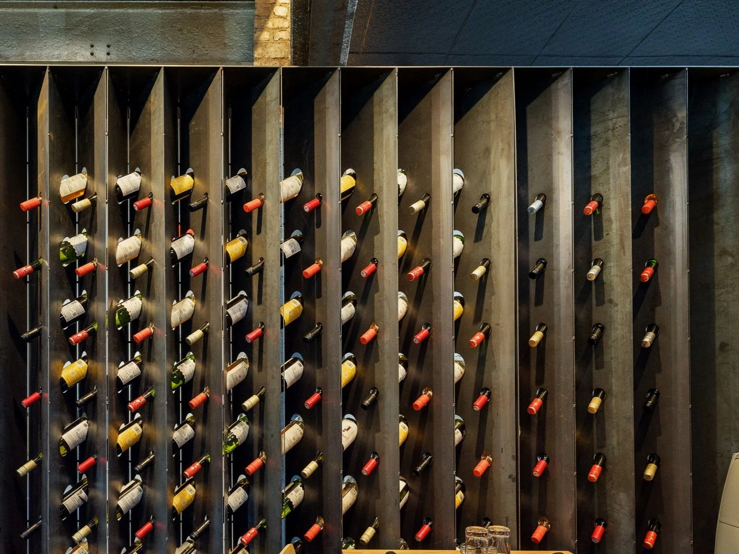
The material palette of the existing building remains unencumbered: existing masonry walls, white-washed timbers, polished concrete and wood floors are mostly original. Insertions in the space are of a limited, complimentary palette: white oak, white quartz, glass and greenery create an all-encompassing warmth. The building shell and structure is left to stand alone in most cases, to accentuate the building’s grandeur and scale. Where the columns are “touched,” special details like a floating metal coffee display highlight the unique moment.
The Six-Plex is a rigorously figured 7500 SF six-unit multi-family building in downtown Bentonville. Originally the site for a small house, the 11,000 SF lot accommodates six townhouses, parking, detention, landscaping, and street and alley access.
The project is located in downtown Bentonville, close to the Walmart corporate office. The overall project requirement from the clients was to build as many units as possible that could accommodate working families. The property was chosen for its proximity to Walmart, downtown and the bike trail. The site was previously a ranch house sited on 0.26 ac (11,000 SF). The neighborhood had recently been rezoned from an R1 low-density neighborhood to RC2 (now DN2) for higher density development. Parallel parking, a detention pond, front yards, street trees and fire-access drives are all configured in the site.
The building’s formal strategy consisted of pushing everything to the edges and maximizing the buildable area volume. The roof gables and porches are then subtracted from the overall volume. The second floor footprint overhangs the first, taking advantage of the “eaves” allowance in the code. The design manages to facilitate the strict Bentonville form-based code while subverting the new urbanism formal pastiche; it includes front porches, cement-board “masonry” siding, and street and bike path connections.
Our strategy came from a place of reduction: what is necessary? What is unnecessary? Undeniably a “budget-beater” project, the simple and efficient utilization of materials creates a contiguous figure that belies its modest construction. The ubiquitous gable roof form created a cavity for services, while using a standard truss and roofing material type. By aggregating the humble gable figure, and applying an abstract color scheme, the chunky zig-zag becomes a singular and unique figure in the urban landscape. This typology is reminiscent of urban and vacation townhouses in Scandinavia. Ikea vanities, coupled with minimal and straightforward interior detailing create a sparse, yet appropriately scaled interior. Fiber cement board panels with aluminum channels creates an abstract exterior. One casement window size further simplifies the project. Taken together, these simple, yet purposeful, strategies produce a striking multi-family building with an attainable construction budget.
The desert box house, fondly named by the client, is what it sounds like. A 4500 SF custom modern residence and studio located in a low-density suburban neighborhood of Phoenix, the monolithic house and studio facilitates the fundamental needs of the client: hospitality, production, and art.
The quiet and imposing figure of the house sits centrally on a former horse field against a desert backdrop. As an object, it stands in stark contrast to its landscape. The formal language of the house consists of two simple, distinct volumes. The primary, lower volume for domestic life and the upper volume and terraces for the work of the photographer.
Appearing to be sculpted from a single block of stone, the volume of the house is conceptually solid and designed as a series of subtractions to make the interior primary space as well as the exterior porches. The secondary spaces such as bathrooms and closets comprise the solid poche.
The large, central open space for entertaining and living is flanked by the owners' suite and children's bedrooms on either side. The expansive west living room glass wall can be opened completely to create a de-facto courtyard framed by the deep west porch and pool beyond. The upstairs volume, accessed only by an exterior stair, accommodates the full range of activities required by the client's work as a photographer and videographer.
Both exterior and interior material palettes are minimal: only white stucco and glass for the exterior and analogous white surfaces or white oak panels for the interior. The material that starts at the ground finishes at the sky, emphatic and absolute without horizontal interruption. The glazing is resolved similarly, with no horizontal mullions, only vertical joints. The project realized the program while intentionally keeping the form of the house a perfect rectangle, the same can be said for the studio above accessed only via an outside stair that faces the street, ensuring complete separation of living and working.
Photos by King Lawrence
The Hatch House is a renovation and addition for a local artist and her family. The existing house was a modest brick farmhouse built in 1950, overlooking tranquil fields. To optimize the beauty of the landscape and create a unique open dwelling for the client, we asked ourselves how we could blend the existing structure into a reimagined modernist design while keeping the original integrity of the house.
The client wanted a fusion of color and functionality that reflected her artistic style and fit the needs of her family. As an artist, the client was clear that the space needed to represent more than the average home. It needed to be more than functional and more than pretty. Having the house feel fluid and inspiring was just as important as budget and space for kids to roam. Weaving the client’s artistic style into the design urged us to incorporate color in harmony with the minimalist design that we typically practice. The result: a bright, playful, and curated interior with clean edges and cubist pattern.
The client leaned into the radical, allowing us to relocate the living room and replace the space with a deep cobalt blue front porch. We added a cantilevered second floor holding the primary suite, which includes the bathroom, closet, and bedroom. The client valued efficiency and together we decided on an enfilade spatial sequence in the primary suite which is not typical in residential builds, but suited the needs of the family. This means that one must pass through the bathroom to get to the bedroom, creating fluidity and efficiency in the space.
To respect the existing conditions, we worked with many of the same materials already used in the house. We used the same color brick on the exterior, and tweaked the original hipped roof to serve other purposes while still looking continuous from street view. Balancing the placement of materials was done intentionally, working primarily with wood, concrete, and brick. Concrete makes a statement and thus is placed in the entry of the home. The brick is inspired by the original structure and used on the outside of the house fashioned into a new pattern, paying tribute to the blend of past and future.
Photos by Andrew Camarillo
TFR Residence is a single family house located on the site of an abandoned trout farm on five acres of land in Springdale AR. The 2800 SF house includes three bedrooms, three bathrooms, an office, and large living/dining/kitchen space.
The clients’ brief was simple: create a modern space that is minimally articulated. To that end, the project focuses on a clear formal language (solid/void), elemental material palette (concrete, glass, charred wood), and large spatial and formal moves dictated by relative proportion. The house is oriented to take advantage of the view of the pond directly on the site, which was historically the first of a sequence of trout ponds that travel down the extended site. Comprised of overlapping volumes, the compact figure of the house embeds into the steep hillside, allowing a multitude of landscape views and interactions.
The exterior and interior of the building reveal a strict formal dichotomy between solid / utility and void / leisure space as expressed through material and formal relationships. The primary leisure void spaces of the house are punctuated by discrete white oak casework volumes that hold all of the utility and functional requirements of the house. The domestic components of utility are emphatically solids within the house; they are read as opaque and concealed. There was a conscious effort - down to the smallest detail - to assure that any component of the house that is utile is concealed within solids so the solid/void language is absolute.
These white oak casework solids are space regulating figures; the primary figures are the utility volume in the kitchen, the master wardrobe, and the laundry/storage casework. The minimal, simple figures belie the intricacy of detail and program held within them - in the kitchen casework there is a bathroom, HVAC closet, utility closet, storage closet, refrigerator, double oven, and pull out pantry. The casework extends from floor to ceiling, has no visible hardware, and has a continuous finish to read as one surface.
In contrast to the strict solid/void language of the house, the floating stair is an anomalous liminal between-space of the house. Because it is both spatial and utile, the stair cedes to both domains of utility and leisure. It links the open space with a volumetric figure that is both open (translucent) and defines edges, and therefore defines itself within the larger space as a space-within-a-space. The stair is a sculptural yet functional object that has multiple readings through the perforated metal. It provides very normative, necessary vertical movement through the house but does it in a way that allows it to be read as “not there”.
Upon entering the house, the landing marks a cross axis for the navigation of space through - at this juncture you can look below through the stair to the public realm, up through the stair to the private rooms, and out through the expansive pivot door entrance. From the formal entrance, the user can ascend to the increasingly private levels or descend to the public, entertaining space that opens onto the pond.
Straightforward material rules govern the operations of the house. The material palette of the house is emphatic and elemental. The exterior materials are site-cast concrete, black charred wood and job-built glass assemblies.